Sunset boulevard redesign

Easy interface for quick use

An optimized User interface for a better experience when it has to be quick

My part

  • Collecting research
  • UX and userflow
  • Wireframes
  • UI design and optimization
  • Design an improved version

The Issue

Confusing interface

The user often experinced confusion when having to handle the online interface of the ordering system of the resturant. They often got stuck in the process of finding the right thing to order, because there was a confusing layout.

Research

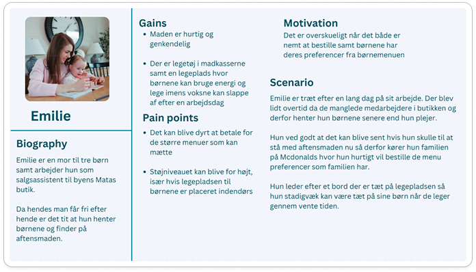
Before we are able to change anything about the design, we had to figure out, where the issues of the userflow where rooted. To figure that out we observed the typical user of the order system and what their needs are. The user research was done in person and helped us form a persona that got used as a guideline for our design
design choices

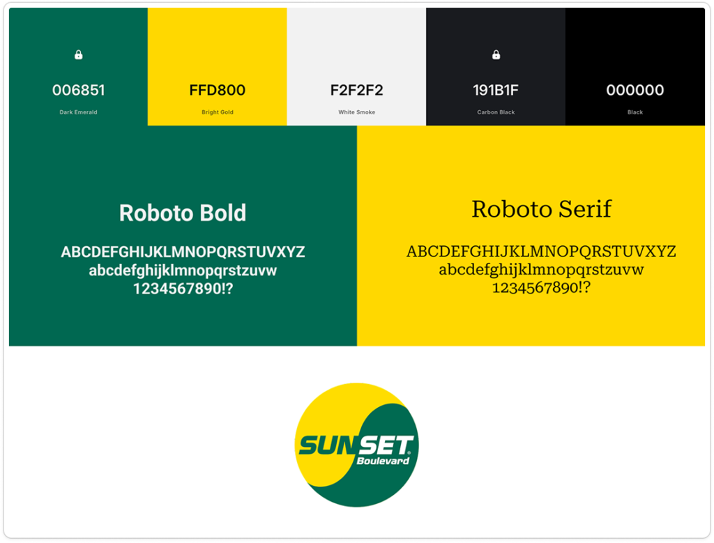
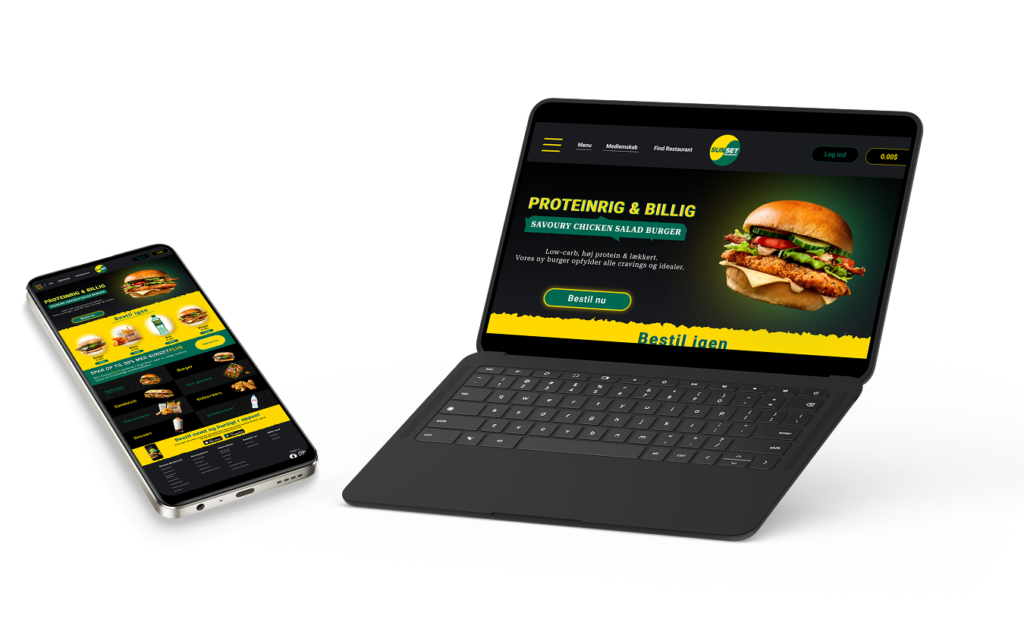
TO make the interface recognizable as part of the resturant, the choice of colours and font were purely based on the brands existing identity. This choice was made so users understand and can make the conection,that the website is linked to the resturant.

First sketches

In the early stages of designing a low fidelity version is best to visualize if the first idea would make good produkts. In this stage components get a second thought or a complete rework. Here it also makes sense to get rid of extra content thatdont contribute to te optimal outcome of the product.

Choosing the right design

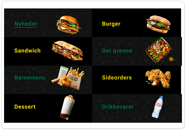
While working on the final versions its important to be your own biggest critique. Its important that the final product works flawless. So naturally while working we decided that some of the colours we choose arent the best,  so we took a few changes to make it more easy on the eyes. 

The important components

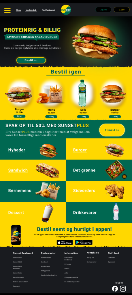
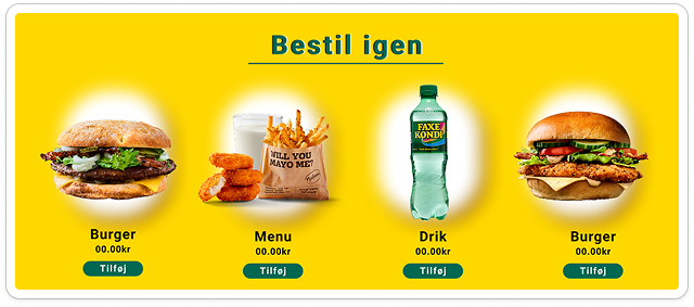
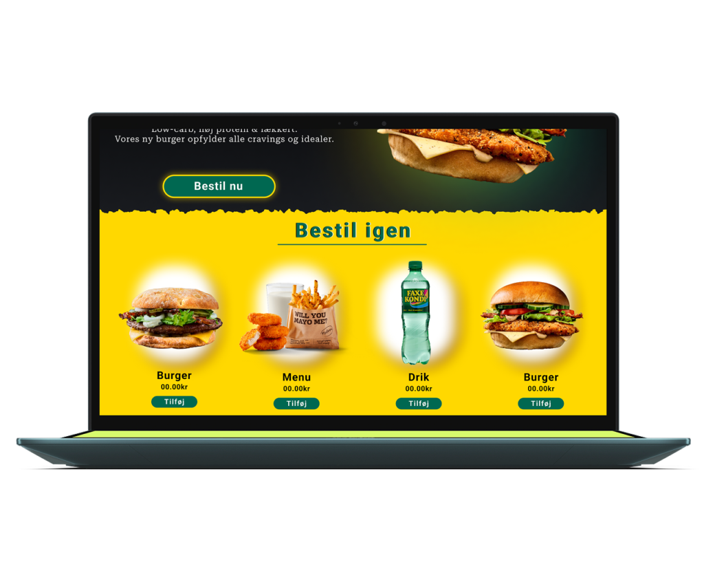
Our original problem was, that the user had issues guiding their way through the website when ordering food. An easy solution to this was adding the option to re-order the same thing from the previous time. Other than that we also made the sections of the different categories on the app more clear and easy to understand. 

Final result

After we combined our personas issues with the other research we did and got creative, we found a way to make the user experience easier and more relaxing than the previous option. To reach the best design It didnt take more than just a simple layout for the options and a function that remembers past purchases.